Confectionary
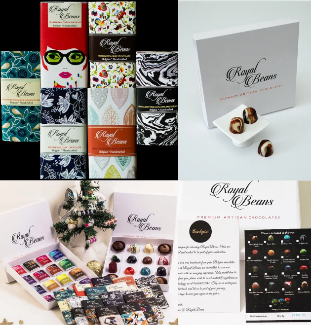
Royal Beans had a premium handmade product, but its brand and packaging didn't reflect the same level of quality. We reworked the brand and packaging to strengthen its premium positioning, differentiate the range and create a system built to scale.
Royal Beans was a handmade chocolate brand created by professional chocolatiers, using carefully selected ingredients and no artificial preservatives.
With the brand moving from an online presence towards premium retail, it needed a visual identity that better reflected its product quality and growing range.
Problem
The existing identity lacked consistency across colours, typography, patterns, effects and logo applications.
The packaging also had issues with print quality, material, product information and overall perceived value.
New products were being introduced across different chocolate categories, but there was no strong visual architecture connecting them.
What needed to change
Reposition — Build a premium identity rooted in craftsmanship, purity and timeless elegance.
Differentiate — Create a distinctive packaging system across the range.
Scale — Build a flexible architecture that could accommodate future products consistently.
Strategy
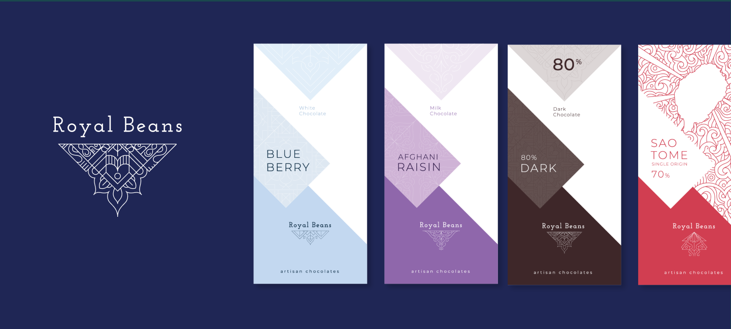
Royal architecture became the starting point for the visual language, translating craftsmanship and timeless elegance into a contemporary premium expression.
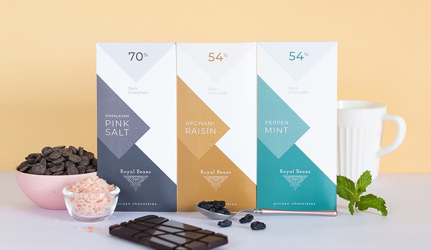
The aim was simple: make the quality customers were buying visible before they opened the box.
Design
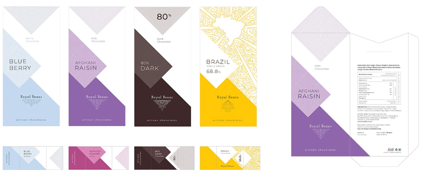
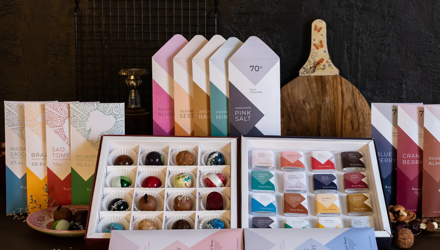
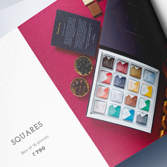
We created a visual system across 17 flavours and 4 categories: Milk, White, Dark and Single Origin Chocolates.
Four architectural motifs helped distinguish the categories, while colour created variation across products without breaking brand recognition.
The system extended across packaging, wrappers, boxes, bonbons, menus, bags and catalogues, with finishes including gold foiling, Spot UV, Textured UV, matte thermal lamination and velvet lamination.
Outcome
Royal Beans moved from an inconsistent product range to a unified identity and packaging architecture built around its premium positioning.
Individual categories could now stand apart on the shelf while remaining recognisably Royal Beans, giving the business a clearer system for introducing new products as the portfolio expanded.
The redesign gave Royal Beans a visual presence aligned with the craftsmanship and quality of its chocolates, while creating the consistency needed for its move towards premium retail.
More importantly, the brand was no longer dependent on redesigning each product independently. Royal Beans now had a scalable system that could grow with its portfolio while protecting recognition and premium perception.