Paperclip

Design

Gir Organic A2 Pure Ghee packaging Gir Organic brand imagery

Paperclip had outgrown the way it was being perceived. We changed the brand so the business could become what it was already evolving into.

3x

Average project
value

2x

Brand strategy
work

2x

Long term
engagements

2x

Revenue
growth

3x

Client
scale

The Trigger

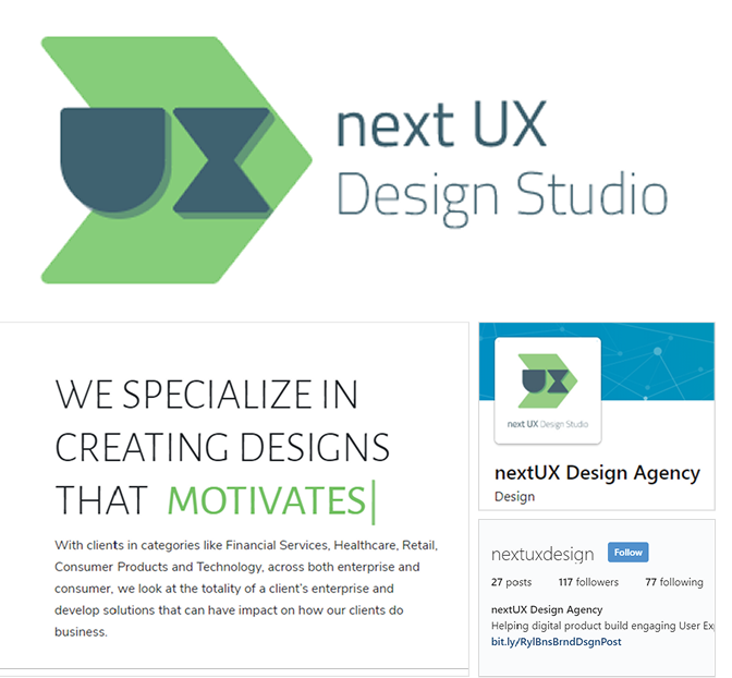
Paperclip did not start as Paperclip. It started as Next UX, a business focused on UX and UI for digital products and experiences. As the business evolved, it moved into brand strategy, brand design, product design and broader experience work. The work was becoming more strategic while the brand continued to communicate something much narrower.

Punam Natural website showing the farm and product pages

Problem

The business had evolved but the brand had not. Next UX immediately anchored the company to UX and UI, making it harder for prospective clients to imagine Paperclip working on broader strategic and brand challenges.

A name that created friction

The name was not particularly intuitive to pronounce and often needed explaining before the team could explain what it actually did.

An identity that understated the ambition

The visual identity did not reflect the quality and complexity of the work or the confidence needed to attract the clients Paperclip wanted to serve.

What needed to change

The task was not to make Next UX look better. It was to change what the business could be perceived as. Paperclip needed a brand that did not describe one design discipline but represented the broader value it created.

1. Move beyond UX and UI.
2. Create room to expand into brand and experience design.
3. Communicate greater strategic maturity authority and confidence.
4. Give a small team solving complex problems a meaningful memorable name.

Strategy

The biggest change was not visual. It was conceptual. Paperclip moved from defining itself through what it made to defining itself through the value it created.

Next UX

A name built around a discipline.

Paperclip

A name built around an idea.

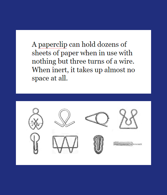
A paperclip is a simple object that holds many different things together. It became a useful metaphor for a small team bringing together different disciplines, people and ideas to solve complex problems.
The name gave the business room to grow.
Gir Organic A2 Gir Cow Ghee jar placed on green grass

Design

Making the strategy tangible

We developed a new brand around Paperclip, including naming, brand strategy, positioning, visual identity and brand expression.

The objective wasn't simply to create a new identity. It was to make the brand reflect the business we were becoming.
Gir Organic ghee jars showcasing the brand identity and packaging

Outcome

The change affected not only how Paperclip looked, but how the business could operate and sell itself.

Broader conversations

Paperclip could have more conversations around brand strategy and broader design problems instead of being automatically categorised as a UX/UI vendor.

Longer, higher-value engagements

The new positioning supported longer-term relationships and higher-value engagements.

Greater authority

The brand gave Paperclip permission to have broader strategic conversations without repeatedly explaining why a UX company could solve them.

Impact

The real impact wasn't the new logo. It was the shift in perception, positioning and commercial opportunity. Paperclip didn't need a better UX identity. It needed a brand that could accommodate the business it was becoming.

That thinking now sits behind Paperclip's approach: help businesses figure out what needs to change and design what comes next.

3x

Average project
value

2x

Brand strategy
work

2x

Long term
engagements

2x

Revenue
growth

3x

Client
scale